Use Storytelling to Increase your Price

Mike Preuss
CEO

This post is Part II or II of our storytelling series. You can find our first post, “Connecting Dots to Tell Your Story” here.

The same principles that Pixar uses to craft their hit movies like Finding Nemo and Ratatouille can be applied to your own investor updates and pitch. Awesome right?

I recently attended SaaStr and had the chance to see Jason Katz the Chief Storyteller at Pixar and Peter Arai the CEO & founder of Prezi talk about the 3 Parts of Visual Storytelling.

Part 1 – Takeaway Message

What is the message you want to leave with your audience? For finding Nemo it is faith vs fear, but the same concept can be applied for business.

At Visible we encourage you to lead with your true north KPI followed by a big ask. Afterall, Investor Updates are most valuable for the company. Leverage your stakeholders to help make introduce to ideal customers, provide guidance on your go-to-market strategy or source new candidates. With each update you have the chance to leave your stakeholders with a takeaway message, don’t squander it!

Part 2 – Structure and Visuals

How do you structure the visual elements to enhance your story? This could be through framing, data visualizations and more.

In addition, your story should follow a structure of beginning, middle and end. Combing structure & visuals can have a profound impact on delivery your key takeaway. Bonus points if you use the same comparable metrics for each update.

One of my favorite posts around data visualization is, “Remove the legend to become one”. This chart:
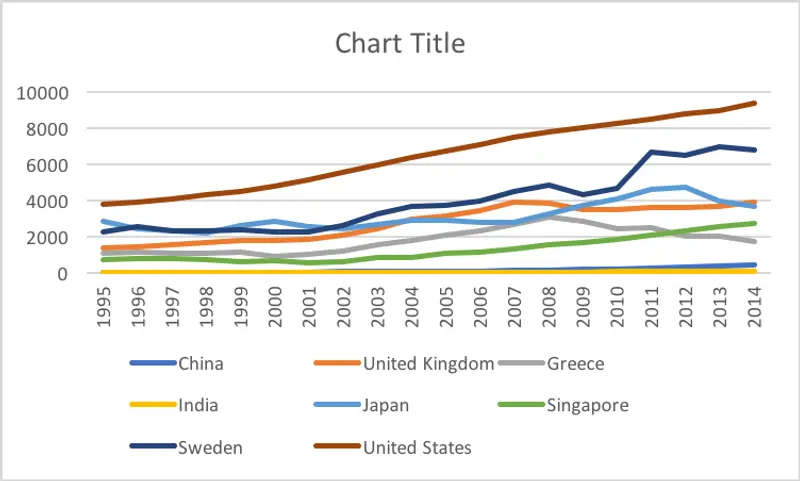
Is actually the same chart as this one with the same underlying data. (Make sure to check out the post to see how to get here!)
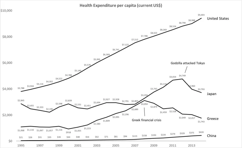
Proper visuals can make all of the difference right?

Part 3 – Delivery

The final part of visual storytelling comes down to delivery. With your stakeholder updates you want to get your message across as efficiently and effectively as possible. You shouldn’t create more work for your stakeholders to get your key takeaway message.

This is why we make it so our customers can control the delivery of their updates through being rendered in email, to PDF, web and Slack.

Great so now we know the 3 parts of visual storytelling but what value can that have on my business? Well it turns out…a pretty big one.

I recently saw Stephen Day from Navidar present at an offsite around M&A, specifically around how to get the best price for you company. He broke it down into this brilliant and simple equation:

Price = Value + (Compelling Story + Competitive Process)^Evoking Emotion

To break this down. Value is the fundamental value of your business. This could be a discounted cash flow analysis to find your valuation.

Related resource: Discounted Cash Flow (DCF) Analysis: The Purpose, Formula, and How it Works

However, you can clearly see how your story and ability to evoke emotion can generate a much higher price than your fundamental one.

This doesn’t just apply to valuation. This can be the pricing of your own product or service as well. The best brands are the best storytellers and they typically elicit the highest price.

Craft your own framework and tell your story. Sign up to Visible today to get started.

Up & to the right,

Mike & The Visible Team

You may also enjoy:
Product Updates
Shaping the Future: Unveiling Our Brand Refresh
Visible started as a way for founders to update their investors but has since transformed into a purpose-built platform for both founders and investors. Since 2014, we’ve powered over 3M interactions between founders and investors. Our brand refresh represents our commitment to equip founders and the investors who back them. Founders can now manage their investor relationships and capital raises from start to finish. Investors can centralize data, uncover insights, and report to their LPs and stakeholders—all from one place. We are excited to unveil our refreshed brand, marking the beginning of the next decade in our dedication and commitment to founders and investors. Equipping Founders and Investors for Growth Raising capital is fundamentally about building relationships. Founders and investors spend months forging connections that, once solidified by a term sheet, can evolve into partnerships lasting 8 to 10 years and beyond. We set out to highlight the people behind the investments, not just the companies or firms they represent. As we continue to grow, you'll notice more familiar faces from different startups and venture funds featured on our site (👋 Hi Lacey!). Shaping Our Future Across our website and marketing assets, you’ll see 3D shapes floating in the background. While they add aesthetic appeal, they also carry a deeper meaning. For example: We believe raising capital from VCs or LPs closely resembles a fundraising funnel, a concept brought to life through the funnel shape that appears across various pages and assets. Sphere, torus, and pill shapes symbolize the connections between VCs, founders, and stakeholders, reflecting the interwoven nature of these relationships. These forms also symbolize forward momentum and the continuous progression within the venture ecosystem. As our product has evolved to offer greater flexibility in moving data into and out of Visible, you'll notice pipes integrated into the design, visually representing the seamless flow of data through our platform. Logo and Wordmark To maintain and perpetuate our brand equity, we opted to anchor our brand to our current logo and wordmark. The Visible logomark is made from three overlapping, equilateral triangles. Each triangle is slightly transparent, allowing the mark to interact with other design elements. These triangles represent human relationships and the connection between founders and investors, which is core to our mission and vision for our company. Color Palette Our signature black primary color remains, but we've refined our palette for a fresh look. We've transitioned from a complex, rich color scheme to a more cohesive and defined palette, creating a unified and bold approach to color across our brand. Introducing the new Visible color palette: Product Guided by our core values of trust and transparency, we designed our product to embody these principles. Our product visuals across the site are predominantly high-fidelity for the first time, highlighting its capabilities visually rather than relying solely on words. The updated typography and refined color palette are seamlessly integrated into our product screens, further enhancing the overall brand experience. Voice & Tone A brand is more than just its visual identity; it requires a voice and tone that harmonizes with its design. We aimed for our voice to be authentic, credible, and consistent, supporting both investors and founders alike. This commitment led us to define key principles for our voice and tone: Be a guide Less is more Recognize that different users face different challenges As you explore our marketing site, we hope Visible reflects these values and resonates with you. Transparency = Trust As we noted earlier, raising capital is fundamentally about relationships. Trust and transparency form the foundation of any strong connection. Throughout our website, you'll notice subtle transparency elements that embody this core principle. This new iteration of our brand is built to scale, but that doesn’t mean we won’t continue to evolve and elevate the experience for the betterment of our prospects and customers. Here's to shaping the next 10 years! Up and to the right,  The Visible Team
Product Updates
Product Update: Turn Emails Into Insights With Visible AI Inbox
Customer Stories
Case Study: Airtree Venture's Transformation with Visible
Fundraising
9 Tips for Effective Investor Networking