Blog
Product Updates
The latest updates and improvements to the Visible application.
All
Fundraising Metrics and data Product Updates Operations Hiring & Talent Reporting Customer Stories
founders
Product Updates
Recurring Updates – Building Better Habits
We always strive to reduce the friction for letting companies tell the right story to the right stakeholder at the right time. Recurring Updates is our latest step in that direction.
Recurring Updates simply let you choose a time period on which you would like your Updates to be prompted to send (think of them as recurring calendar invites but for your data and reports). You can have your investor updates recur every month, team updates every week and board reports every quarter. We’ll automatically grab your new data for the respective period and all you have to do is provide the context.
Create a Cadence
Utilizing Recurring Updates will get you into a cadence and form a great behavior over time. Your stakeholders will know that they will hear from you in a timely, professional and visual way. You’ll be able to leverage your stakeholders and spend valuable time diving into major issues in your business by saving time on your stakeholder updates.
Build a Rapport
Your stakeholders will be more engaged in the business than ever. The secret to all great relationships is communication. Your stakeholder relationships are no different. Recurring Updates make it easy to invest in your stakeholder relationships without having to invest too much of your time.
Utilize our Contact Lists functionality to segment various groups of stakeholders and use them in your various Recurring Updates.
Business Intelligence for your Stakeholders
With any Update sent on Visible we close the loop providing the sender with detailed analytics of who is engaging with the content you’ve crafted. Quickly understanding who is engaged and disengaged. You’ll know exactly where to start a conversation with any stakeholder.
FAQs
Q: How do I create a Recurring Update?
A: Easy. When you are sending an Update we’ll ask you if you would like to make it recurring. You can also create one from the templates section in your Visible account. Find step by step instructions in our knowledge base.
Q: Do Recurring Updates automatically send?
A: No. They are put in a draft in your Visible account. Only those with edit access to Updates can see the drafts. You still have to hit send and are able to make any changes (or delete it completely). Someday we may let you automatically publish Updates but that would be an explicit action and setting.
Q: Is there a limit to how many Recurring Updates I can have?
A: No! You can have as many Recurring Updates as you like!
Q: Why should I be using Recurring Updates?
A: They’ll save hours of time but more importantly they will help you create a great behavior that will let you attract more talent and more investment dollars.
Q: Am I reminded when I have a Recurring Update?
A: Yes! We’ll send you an email reminding you that the Update is in draft and link directly to it so you can make any changes and send!
We hope you enjoy. As always, let us know if you have any questions or feedback. You can directly schedule a quick 15 minute consultation by clicking this link.
Up & To the Right!
-The Visible Team
founders
Product Updates
Shameless Plug: The 97 Second Update
Send an Investor Update in Under 2 Minutes
We recently rolled out our Google Sheets integration in Beta and are stoked on the possibilities this presents for telling the story around your data. With the addition of our Google Sheets integration we have taken what used to hours of work into a few minutes of your time… Seriously, check it out:
In addition to sending out Updates you can do the following with our Google Sheets integration:
Automatically grab data from Google Sheets and bring into Visible.
Create beautiful visualizations and dashboards for your stakeholders.
Combine Google Sheets data with other data source integrations or custom metrics.
If you’re ready to start telling your company’s story using Google Sheets and Updates you can check out a quick article here or shoot us a message at hi@visible.vc
founders
Product Updates
Xero Dashboards, Export Charts & Forecasting!
Charting Your Xero Data Using Dashboards
This release is packed with a lot of great functionality so “Hold on to your butts”, as close confident Samuel L Jackson would say.
First up. We just launched our Xero Integration. Easily connect to your Xero account and we will automatically pull TEN metrics from your Profit & Loss report and Balance Sheet. Start building beautiful Xero Dashboards in seconds!
That brings us to — Exporting: We constantly hear, “How can I print my screen?”…or “Is there an easy way to put my charts in a board deck?”. Fear no more, exporting your charts is now here!
Simply hover over any chart, click the gear and select “Export”. We’ll let you customize how you export the chart and support SVG, PNG, and JPEG image files. We also give you some clever defaults to nicely format charts for PowerPoint and Keynote! Read more about this in our Knowledge Base.
The chart below directly came from Visible! Feel free to use in any of your pitch decks.
Now we are grooving. Unicorn status isn’t in vogue like it used to be; however, hitting your forecasts will always be cool ;). Feel free to add as many data points into the future as you’d like! Click the “+” icon in any metric and you’ll start to see what 2020 looks like. And if you need help getting started with financial modeling, we’ve got you covered right here!
You can now export all of the data of your company. We are rolling this out in “beta” so shoot us an email and we will tell you how to access this easter egg.
We hope you enjoyed this update and as always please feel free to send us any feedback or questions our way!
#tellyourstory
-Mike and The Visible Team
founders
Product Updates
5 Steps to Build Your Dream Business Dashboard
Despite their popularity, most dashboards live up to only a fraction of their potential. In the first full flurry of enthusiasm for a newfangled technology, short shrift has been paid to how to design focused, thoughtful, and user-friendly dashboards.
Traditional dashboard design has tended to prioritize the right success metrics, only after which a hodgepodge of charts and a slew of gauges are stitched together in a mishmash single page. While the negative impact of such a design philosophy is curbed in small startups of three or so employees, it bodes poorly for any future expansion and development, when data naturally and exponentially starts to silo.
This article discusses five key strategies that founders and managers needs to keep in mind to make dashboard building and implementation effective.
1. Know Your Audience
Begin holistically: identify your target audience. Dashboards can be broadly categorized as strategic, analytical or operational. It’s difficult, if not impossible, for them to be all three at once. Tailoring your dashboard’s data to suit its single audience is key. Without a clear understanding of their requirements, you lack the ability to craft a meaningful message that resonates with your users.
Who is the dashboard’s end-consumer and what are their information requirements? Is the dashboard destined for financial monitoring by the executive team, or is it intended for daily analysis by the marketing team?
2. Avoid Clutter: Prioritize Data
Dashboards are easily cluttered. Given the tons of metrics that you could collect, and the space limitations of a dashboard, it’s imperative that you identify what data matters upfront.
Find the core. Your dashboard should have a core theme centering on a specific problem. A sales dashboard may ask “How can we make our pipeline more effective?” Or a marketing dashboard: “How can our marketing investments be optimizes?” Identifying this core will give you the logic for filtering superfluous information.
Thanks to your grip on your audience and their usage goals, you are better set to determine the focus of your interface design: key performance indicators (KPIs). Every application, from fitness trackers to powerful online analytics software, is built around a few KPIs. FitBit follows steps, calories in/out, and weight loss, while Google Analytics monitors conversions and traffic. Having KPIs in place ought give you a handle of the dashboard’s general tone and trajectory.
3. Keep It Clean, Keep It Simple
Variety for variety’s sake is categorically not the spice of dashboard design. Due in some part to their visual nature, designers have a tendency to ornament their dashboards with all sorts of visual distractions (for reference, check out this chamber of dashboard horrors).
Instead, restrict the aesthetic bells and whistles. Fewer extraneous graphics place focus right where it belongs: on the content.
For example, try to keep your color scheme simple: let green mean good and red bad. Adding in other colors like blue for improving, or orange for declining, quickly confuses things. Similarly be wary of piecharts! If the data falls in to a few simple categories, a pie chart can be effective. However, countless studies have testified to unreadability of the thinner pieces of a pie and their inability of communicate changes over time.
4. Make a story emerge!
It isn’t good enough to make the information available. If you want your data visualizations to be comprehensible and lead to action and change, you need to help tell a data-driven story. Begin by asking how the data will be viewed:
What story are you trying to tell?
Which data supports that story, and illustrates it most clearly for the end user?
Which specific data cluster is the user going to engage with most?
For example, ensure that data is displayed in logical groups. If a dashboard includes both Financial KPIs and Sales Pipeline, make sure to position the financial data together, while the Sales Pipeline data is displayed together in a separate logical bundle.
Similarly, the most important real estate on a dashboard – the top left hand corner – is typically earmarked for a company logo or a navigation tool. Given that most Western languages will read from top to bottom, left to right, that space should be a jumping-off point for most readers. It should be prioritized for critical data.
5. Put Perfectionism Aside
Ultimately, all thoughts of a silver bullet dashboard are idealistic. No dashboard is going provide every possible answer in a single view to an evolving business. Trying to do so only ends in a knotted web of choices, alternatives, and options for the end user.
Instead, it suffices that you know your users, you keep your data uncluttered, that your design is simple, and that you tell a story. With these four broad hallmarks of good data driven dashboard design, your developing business will be ready to generate relevant insights as it grows.
Ready to build your dream business dashboard?
Visible is the best way to tell the unique story around your company’s data, helping you keep everyone who matters to the business engaged in the business.
With the ability to create multiple dashboards, you can get even more granular about who you are presenting data to. Raising a new round? Build a “Potential Investors” dashboard to highlight some of your most important growth metrics. Looking to lean on industry best practices? Build a dashboard using one of our pre-made templates from firms like Andreesen Horowitz and Version One Ventures.
Start Your Free Trial

founders
Product Updates
Innovate, Don’t Duplicate: Why We Rebuilt Visible from the Ground Up
You will hear it from almost every developer: “I could do it better (and faster)”. Refactoring or rewriting an application is developer porn. You explore new technologies, update your stack, redefine the architecture… all these excite our reptilian brains. So great, let’s rewrite the application! But wait… we are still trying to nail our product/market fit, we are still growing the company, we have a legacy application running, we have a customer expecting updates… are we really doing this?
Owning the code base
The Visible 1.0 code base was over 1.5 years old and had been written and maintained by different contract developers to build the prototype while we searched for product/market fit. The code was ok, it worked, but none of the contractors were full time employees of the company. We faced a big challenge of building an engineering team of 3 or 4 people that owns the codebase just as we started to get validation that we were on to something.
Our team was aware and knowledgeable of the technical decisions that were made in Visible 1.0 but there was very little documentation; as to be expected in an MVP. Whether we would have started from scratch or tried to improve the existing code, we needed to know the entire code base through and through to onboard new team members. Additionally, it is definitely easier to document and know the code you write than the code you read. And it is true for every recruit, so the gain here is multiplied by the size of the team. Rewrite 1 – Reuse 0
Running the business
This was the biggest concern surrounding a rewrite, no question. How could we run the business during the rewrite when we have customers relying on the existing version? It was out of the question for the engineering team to support the old version while creating the new one. It would have meant twice as much work and supporting two versions is never fun. As a result of this decision, the company would be effectively split in two, the business team would keep working with the legacy software (supporting existing users, getting new ones) and the product team would develop the next version. Having two separate teams isn’t ideal when you are trying to build a united company! We actually underestimated the impact it can have on both the morale of the business team, waiting on the next version and on the engineering team, whose stress level keeps growing as time goes. Rewrite 1 – Reuse 1
Managing expectations
“When a developer gives you an estimate, multiply it by 2 or 3.” You are really putting the entire business in a sort of limbo out of which you hope to get out as soon as possible. There is always the battle between unrealistic deadlines and overly conservative ones. Everyone wants to release as soon as possible but a rewrite will always include unexpected bugs and problems. The schedule will slip and the more it does the more the tension builds. I can’t stress how much a full rewrite is a gamble and you must take that into consideration. Ask yourself, what if the 3 months become 6? 7? 8? It is an expensive decision for an early stage company, make sure to consider the worst case scenarios! Rewrite 1 – Reuse 2
Investing in the future
The last thing we wanted to do was go through this process in the next 3+ years (hopefully ever). We took a particular care building a strong technology stack. Stay tuned for more technical posts but the main idea is that we now have a separate Ruby API and a Ember web client. It will allow for a lot more flexibility in the future. E.g. opening the API to our users, native mobile apps, etc. It’s documented, tested and fun to work in… All of which are important when scaling a tech team, product and company. This is an investment in the future with returns that will hopefully compound in the future.
If you do not tackle technical debt as you go, it will backfire. And since Visible 1.0 was built as an MVP, always evolving and changing in different directions, had a lot of it. We estimated that if we rewrote the code base, with a strong attention on limiting the code debt, we would be at least twice as productive within 12 months. It is impressive what a good technology stack can do to morale and productivity! Rewrite 2 – Reuse 2
Innovate, don’t duplicate.
We didn’t duplicate the old Visible and just change out the engine. We rethought Visible from the ground up based on all of the feedback from current users, potential ones and where we see the product going. It means that Visible is now at least twice the product it once was, it has an entirely new interface and we doubled down on functionality of our most used features. A good part of the past 6 months was actually spent on changing the core architecture; for instance to allow metrics for quarterly (or any frequency) metrics! You can read about the new features in our release article. Rewrite 3 – Reuse 2
Conclusion
Looking back, it was the right decision to rewrite Visible. It took a lot longer than we first estimated, it was a lot more work and stress than we expected but we pulled it off as a team. We got a lot of great feedback, both positive and negative and are already back at work to improve the product and fix the bugs. And the good news is that you will no longer have to wait month before getting them.

founders
Product Updates
Portfolio Charts & Custom Dashboards
Last week we launched some great improvements to the most popular features of Visible:
Portfolio charts, reports & custom dashboards
A new update builder for founders
Ability to quickly add popular metrics
Take a look below!
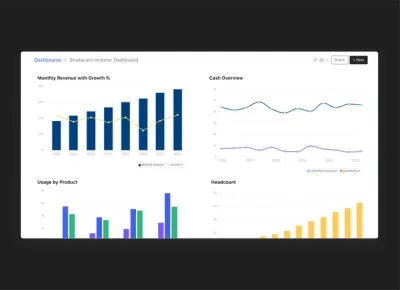
Portfolio Charts, Reports, and Custom Dashboards:
Fund managers can now create their own charts comparing metrics across any of their portfolio companies. Just click the “Reports Tab” from your fund page
.
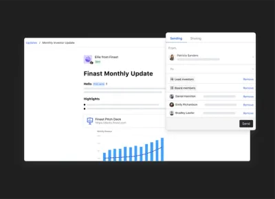
Investor Updates Builder
When building an investor update, founders can now add rich text that is added to the highlight stream and sent in the notification email!
Notification Emails: The notification email your stakeholders receive when you send investor updats will now include your company logo & the highlight text from the update builder. You can reply-all in the email!
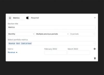
Popular Metrics: In the Manage Metrics area founders can now easily add popular metrics to share with stakeholders
.
Unlock Your Investor Relationships. Try Visible for Free for 14 Days.
Start Your Free Trial