Blog
Product Updates
The latest updates and improvements to the Visible application.
All
Fundraising Metrics and data Product Updates Operations Hiring & Talent Reporting Customer Stories

founders
Product Updates
Intelligent Google Sheets & Our Google Cloud Partnership
Today we are beyond thrilled to be releasing improvements to our Google Sheets Integration and to announce that we are now a Google Cloud Partner. Our application is now available to the Google Cloud and G Suite ecosystem.
What are the improvements?
Many of our customers using our Google Sheets integration restructure, manipulate or change their Sheets files over time. Previously it was tedious making sure these changes were reflected into your Google Sheets Dashboards and Updates.
Our release today allows for intelligent mapping. As your Sheets change we will understand if rows are moved up, down or removed and automatically reflect those in your Visible account. No action is needed on your part.
If you make larger changes to your data set like renaming metrics we may prompt you with a question to make sure we are correctly updating metrics. We will give you the option to fix that in Visible without having to connect & reconnect your connection. E.g. lets say you rename New ARR to New Annual Recurring Revenue. We’ll prompt you with a message similar to the following to let you train the integration further:
All you have to do is hit “Yes” and be on your way:
What’s next?
Google Sheets is our most popular integration, expect to see some more improvements in the coming weeks. We want to make it as easy to get your KPIs and Metrics into Visible.
We’re also working on a great resource to make awesome Google Sheet Templates available to our community. If you want a sneak peek check out our Google Sheet Template Library!
Up & to the right,
-Mike & The Visible Team

founders
Product Updates
Zapier + Visible
We’re thrilled to be launching our Zapier integration out of beta and to bring the power of over 700+ applications to our customer base.
Even better is you can utilize Zapier’s multi-step workflows and add on the Visible trigger to your existing apps.
Not familiar with Zapier? Zapier connects all of the apps you use to automate your workflows. When something happens in a particular application an action is triggered in another. Check out some examples below to understand how you can automate your stakeholder reporting with Zapier and Visible.
Send Sales and Marketing data directly to Visible Metrics.
Send KPIs from Pipedrive, Intercom, Mailchimp or any supported CRM and marketing tool directly to Visible metrics.
Connect to your database!
Want to automatically update Daily Active Users, Transactions Processed or other important KPIs from your own database? Simply setup a query in Zapier and pass along to Visible.
Automate all the things.
Zaps can be simple, complex and tailored to your every need. You can always fine more in our knowledge base and feel free to reach out anytime to support at visible dot vc. We are standing by and ready to help take your stakeholder reporting to the next level.

founders
Product Updates
Product Update: Filtering & Bulk Editing
We recently pushed some great improvements to the Data section on Visible to make it easy to search, filter and edit your respective metrics. We also make some speed improvements so the data section should load faster as well!
Filtering & Sorting
You can now sort and filter by categories & data sources. Simply click the filter icon and select your respective fields to filter the data table.
Bulk Editing
Select multiple metrics and quickly edit many metrics at once. You can quickly assign a new category and metric type with the new bulk editor as well as delete metrics you no longer need.
Be on the look out for even more improvements in the future. We hope you enjoy!

founders
Product Updates
Xero Tracking Categories
Introducing Xero Tracking Categories
We recently launched additional improvements to our Xero integration that all of our customers can start taking advantage of today.
In addition to getting financial metrics and chart of accounts metrics from Xero, you can now filter any of your metrics your respective Xero tracking categories.
It’s as simple as selecting a metric and then clicking the drop down to apply the tracking category. You can add as many of the same metrics as you’d like. E.g. if you wanted Revenue across all of your sales regions you can bring those in!
Protip: Transform your Xero Tracking Categories with our formula builder.
You can read more about the Xero tracking categories in this knowledge base article. Questions? Send us an email.
Up & to the right,
-The Visible Team

founders
Metrics and data
Product Updates
Video: Formula Builder (Customer Acquisition Cost)
How to Calculate Customer Acquisition Cost in Visible
Check out the video above to get a glimpse of our formula builder. In this example we calculate customer acquisition cost by combining data from Salesforce and Google Sheets!

founders
Product Updates
Consolidated Xero Reporting
Automatically Consolidate Multiple Xero Accounts
If you run a business that operates in different countries, different currencies or one that requires many Xero or Quickbooks accounts, you will know the pain of consolidated reporting.
Being able to quickly get an understanding of Revenue, Cash Position, Expenses and more can be a pain. Luckily, with Visible and our formula builder, you can now quickly and intuitively combine many accounts for your consolidated Xero reporting.
Customers can connect as many Xero or Quickbooks accounts as needed. From there, it’s as simple as creating a new metric from a formula and building your new consolidated metric.
If you want to convert the currency of a particular metric, you can apply the logic of Exchange Rate * Metric.
You can read more about our formula builder and data transformation in our most recent announcement. If you are an accounting or finance professional, we’d love to talk to you! Feel free to contact us at spectrum at visible dot vc and make sure to check out our partner program.

founders
Product Updates
A + B = C -> Introducing Formulas on Visible
We’re excited to give you a sneak peek & preview our new Formula builder. With our intuitive Formula builder you’ll be able to create functions by using any of your current metrics, from any data source, integration or providing a metrics directly.
This will be a game changer as you’ll be able to dynamically create new metrics and transform your existing data streams directly on Visible.
The Visible Formula Builder
In the example above, we take calculate Customer Acquisition cost by taking Sales & Marketing Expenses from Xero and dividing by New Customers coming from Salesforce. Just one of infinite possibilities!
As new data comes into Visible your formulas will update on the fly and the new data points will be readily available at your fingertips.
If you wish to get on the beta shoot us a note at beta@visible.vc. You can read more about the integration in our knowledge base and we put together this quick explainer video as well.
Up & to the right,
-The Visible Team
founders
Product Updates
April Product Improvements – Data Labels, Annotations, Goals & more
Hey there – We wanted to provide a quick recap of all of the major functionality that we’ve launched in April. As always feel free to send us any feedback, questions or comments.
Data Labels on Charts
You can now add the actual value on the data point on your charts. This will display the actual values of the respective metric on the chart itself.
We suggest using charts with 8 or less data points to utilize data labels or you’ll quickly overcrowd the visualization.
Chart Annotations
While you are creating or updating a chart you can now call out specific data points and add your own context through annotations. Simply click on any data point and add in text.
Goals
With any chart you can now add a goal, benchmark line or threshold targets. Simply navigate to the Options tab to customize your different goals and benchmarks.
File Attachments in Updates
Visible Updates now support file attachments. They’ll be available as one-click downloads and we’ll automatically detect the file type and add a nice icon for you! They are great for more granular financial statements, presentations or supplemental data sets.
Table support in our text editor
Our Updates text editor now supports tables. They are great for structuring any of your qualitative information in Updates.
Other minor yet useful improvements:
Better support for copying and pasting text from other text editors into Visible Updates!
A very beautiful looking success message once you publish an Update in Visible.
-The Visible Team
founders
Product Updates
Announcing Our ChartMogul Partnership & Integration
Visible + ChartMogul
We’re excited to announce our partnership today with ChartMogul. ChartMogul provides analytics for building a better subscription business to over 800 customers (and growing!). By integrating with Stripe, Braintree, Recurly and more, ChartMogul provides turnkey metrics to give you instant insight into your customers.
Visible customers will be able to integrate their ChartMogul metrics directly into Visible and use for their own stakeholder reporting.
Our initial integration includes your recurring revenue metrics, customer metrics, churn data and LTVs. We’ll continue to improve the integration so send any feedback our way. You can find more info on the ChartMogul + Visible feature page.
If you have any questions or comments about Visible + ChartMogul send them to hi@visible.vc. Current Visible users can read more about the integration in this knowledge base article.
Up & to the right,
-Mike & The Visible Team
founders
Product Updates
Winter Wrap Up
With spring around the corner we wanted to provide the latest in the Visible world. Below we’ll highlight some key functionality that has been released over the past couple of months.
Data Source Integrations
We made some great improvements to our existing integrations, added new data sources and currently support 10 direct data sources in Visible.
New integrations include Mixpanel, Advanced Google Analytics and ChartMogul.
Update Improvements
Updates can now be sent through a shareable and trackable link in addition to email. We also added support to save Updates as PDFs and improve the editor experience.
View Example Update
As always, please feel free to directly respond with any questions, comments or to setup a time to chat!
Up & to the right,
The Visible Team

founders
Product Updates
Xero Integration 2.0 – Chart of Accounts
Introducing Xero Chart of Accounts
We originally launched our Xero integration into the Add-On marketplace just over a year ago and it has quickly become one of our most popular accounting integrations. Xero is a cloud accounting platform that has gained in popularity and is beloved by their power-user accountants.
Our initial integration was great. We pulled in your high level financial metrics from your Income Statement, Balance Sheet and Cash Flow Statement. We started to hear more and more that our customers wanted to get granular reporting on their Chart of Accounts — after all, being able to compare your Online Ad Spend to Budget has become increasingly popular as “unit economics“ has become the in vogue term of 2016.
We’re excited to release our Xero 2.0 integration to all that not only pulls in financial metrics but will query and pull in any account from your own chart of accounts.
By pulling in your unique chart of accounts you’ll get to fine tune how you present and tell the story of your most important data.
Protip: Use your actuals from your Xero chart of accounts and compare them against a budget or forecast by utilizing our Google Sheet integration.
We’re excited to be improving the initial set of integrations we used when we launched Visible. Should you have any requests for future integrations or current ones, send us a note to hi at visible dot vc.
Up & to the right,
Mike & The Visible Team

founders
Product Updates
Zapier & Product Updates
We quietly launched some awesome updates to Visible last week that we wanted to make sure got the attention they deserve. The two updates below focus on automation of your KPIs and enhancing the storytelling of your data.
Zapier Integration
Our integration with Zapier is now live! It is in beta so you’ll have to use this link to accept the invite to Zapier.
Link any trigger apps and assign values to your Metrics in Visible. E.g. Every time a new trial of our “Pro” account is started in Stripe I have that add +1 to our Pro Trials Created metric within Visible.
You can find more info in our knowledge base. Feel free to reach out with any questions or recipes that you love!
Update Enhancements
You can now do two commonly requested actions within an Update. 1) Include bold number visualize types and 2) Include 2 charts side by side in an Update similar to a dashboard.
In an Update simply hover over a chart component and click the grid icon to add a secondary chart. You can click the arrow to re-arrange the position as well.
We hope you enjoy these updates! Stay tuned for more exciting announcements in the near future!
Up & to the right,
-The Visible Team
founders
Product Updates
Q3 Product Updates
With Q3 in the books, we put together a wrap up of all the improvements that have been introduced on Visible over the past 3 months.
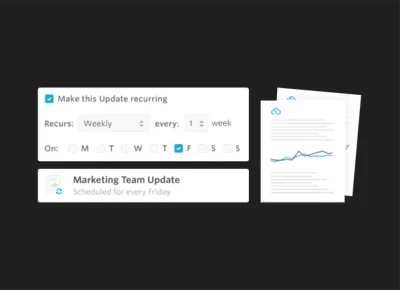
Recurring Updates
We launched recurring updates so companies can focus on telling their story to their stakeholders without having to worry about the cadence or creation of the Update.
Recurring Updates help build a rapport with the most influential people in your business. They are great for frequent team updates, investor updates and for fundraising. Read more about them on our blog: https://visible.vc/blog/recurring-updates/
Business Intelligence Layer
With our new BI layer, we are automatically calculating 5 additional metrics for each metric provided.
Easily show growth changes, rolling averages and more. We also improved charting so you can add as many axes as you wish! Read more about the BI layer on our knowledge base.
Shareable Dashboards
With Shareable Dashboards you can have tight control over who can see what. You may want certain data available to your board which could be different than your team or potential investors.
Shareable dashboards are part of a much larger push towards what we are calling Visible 3.0 which you can read more about on our blog: https://visible.vc/blog/visible-3-0-note-ceo/
Other Improvements
In addition to some major features above we also launched the following:
Ability to search Updates & pagination to increase speed.
New color palette options to give your data a unique twist.
Charting frequency improvements to customize when charts start/end.
Exporting Metrics, great for pivot table analysis.
Coming Soon…
We have some exciting integrations lined up with Zapier, appFigures and Mixpanel. Should you wish to get on any of the beta programs and provide feedback email us at beta@visible.vc

founders
Product Updates
A Note From our Design Team
Our New Chart Builder Colors
We recently added 3 new color palettes to our color picker in the chart builder. The first row of colors (which have always been in place) are from the original Visible color palette. They’re what you would currently see in any Visible charts presuming you haven’t changed the default colors (and let’s be honest – nobody changes the defaults!).
But in case you’ve been looking for an easier way to brighten up your charts, we’ve added 3 new color palettes. The 2nd row is inspired by Visible 2.0 and reflects the more modern colors we use throughout our app. The 3rd color palette is inspired by the simple and smart colors of Google’s Material design. The 4th is inspired by the bright colors of Apple’s iOS. It’s best to coordinate on one color palette for a Dashboard. So if you’re going for the blue in Material, it’s best to use the green in material for your next chart. We plan to make it easier to ‘Choose a theme’ so you can easily stick to the color palette of your choice in the future but in the meantime this should help!

founders
Product Updates
Visible 3.0 – A Note From our CEO
Today’s feature announcement is relatively minor (yet awesome) but its meaning is much greater. If you just want to read about Shareable Dashboards head to the bottom. If you want to hear what we are up to, keep reading. I’m really excited to share Visible’s focused vision for our product and business.
When we on-boarded our first customer almost three years ago (thanks Iron Yard!) our goal was to solve the pain that came with monitoring and managing a privately held portfolio. We constantly heard the same thing from investors over and over again,
“I never get investor updates or know what is going on with my portfolio!”
We set out with a grand vision to build a product used by companies to provide KPIs, updates and cap tables to their investors in addition to a product that would roll all of this information up to the investors and for their own reporting to their investors (LPs).
We learned two valuable lessons from this initial product and go-to-market strategy:
Companies have to want to communicate with their stakeholders and respect their relationship with them. (Btw – we’ve also found that the best ones do and are 200% more likely to get funded)
We were trying to solve too many problems for too many people. We built very average features for all of the end-users which were not 10x better than current workflows in the market.
Despite the issues above we were able to prove that there is a big problem in the space and that we could execute. We raised some funding and started to build a world-class team. We went to the drawing board and launched Visible 2.0 last summer (if you want to check out the technical considerations read Karel’s post).
With Visible 2.0 launched and in market we saw many interesting use cases develop (including but not limited to):
A distillery in NYC sharing depletion and market data with their sales team.
A team at a 900 person travel company providing Updates internally
Marketing and branding agencies sharing campaign and other KPIs with their clients
Innovative CFO & Accounting firms like Xcelerate Financial, Scalability, and LiveCA integrating their clients into the Visible ecosystem.
A church in New Zealand providing updates to the congregation.
And of course our original use case where Unbounce is providing monthly investor updates about their $12,000,000 a year business!
With our learnings and and evolving use cases we started to greatly hone in our product focus and strategy. We removed the cap table, improved our Updates editor, invested in creating great content like our ebook on data distribution and model for total addressable market. Our goal was (and is) to create a frictionless product while helping educate the market.
So what does this all mean? In short, we want to empower companies to share the story of their data with their stakeholders. It doesn’t mean that we are getting out of the investor reporting or portfolio game…quite the opposite. We are doubling down but also building a platform to elegantly handle all the uses cases mentioned above.
What about the product? Starting with this launch we are merging the idea of “companies” and “funds” in our product architecture. Our current customers and users wont know the difference; however, it opens up to handle more use cases & complexities for the future. The first step in this endeavor is sharing dashboards:
Sharing Dashboards
Starting today you’ll be able to share specific dashboards with individuals directly or with one of your Contact Lists. We’ve received a lot of feedback that companies want to only share certain dashboards with certain team members, investors or clients giving them more control over who can see what.
Those with access to shared dashboards will have a feed at the user level of all of the dashboards they have access to along side Updates they have received.
So what is next? Over the coming weeks and months you can expect the following from the Visible team:
Improved data integrations – If you are using our Quickbooks, Xero or Google Analytics integrations give me a shout.
More advanced charting, Updates and ways to present data outside of Visible.
The ability for an individual assign Dashboards or Updates to an entity. E.g. if you are a VP of Sales and getting an Update from a sales manager, you can assign it to your sales entity in Visible or if you are a GP of a VC fund and get a dashboard from a company, you can assign it to the proper fund in Visible.
“Data Pipes”. That is what we are calling them internally for now. Sometimes you need to get raw data from one entity to another for analysis. We will be enabling (on a per metric level) to share a metric with an individual or list similar to Dashboards.
I’m truly excited for what is ahead and to share the journey with our customers and community.
Up & to the right,
-Mike
Unlock Your Investor Relationships. Try Visible for Free for 14 Days.
Start Your Free Trial